A mandatory compliance gate that 55% of users abandoned, redesigned into a guided 5-step flow that 98% now complete.
At a glance
- What it is
- The KYC (Know Your Customer) flow fintech products embed to open accounts. 55% of applicants abandoned it: the technology worked, the instructions did not.
- What I owned
- Senior UX Designer and the only designer, working with four engineers. I owned the redesign end to end.
- The call I made
- The failure path got the same design attention as the happy path. A fail now names the step and what to do about it.
- The constraint
- Nothing could be cut from a high-security compliance flow, so the redesign explained it instead of shortening it.
The problem
BINGO is the KYC (Know Your Customer) verification flow that fintech products embed to open customer accounts. 55% of applicants abandoned it, so the businesses paying to acquire those customers lost more than half of them at the last step before anyone could transact. The verification technology was fine. The instructions were not.
BINGO is the KYC (Know Your Customer) verification flow that fintech products embed to open customer accounts. 55% of applicants abandoned it, so the businesses paying to acquire those customers lost more than half of them at the last step before anyone could transact. The verification technology was fine. The instructions were not.
Role
Senior UX Designer
Team
1 designer, 2 native frontend, 1 backend, 1 ML engineer
Timeline
4 months, 2024
Platform
iOS & Android Mobile App
Business impact
From blocking half of new users to passing nearly all
The gate 55% of users abandoned
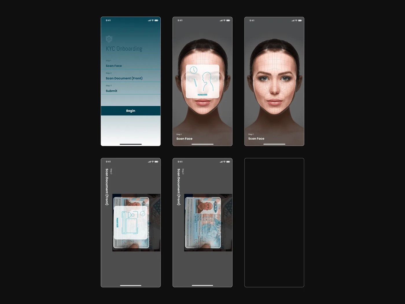
Some users failed three or four times before giving up, and every fail showed the same generic error, so the analytics recorded the attempts but never the reason. Benchmark at the start: 45% completion, task time over 5 minutes, SUS 48.
Most dropped off at the liveness check. They didn’t know what to do when the camera opened.
My role and contribution
I was the only designer, working with two frontend engineers on Swift and Flutter, one backend and one machine learning engineer.
I owned the redesign end to end: the Lean UX Canvas workshop, the benchmark against Jumio, Persona and Singpass, the map of every error and retry path, and Maze testing on wireframes before any high-fidelity work.
The team believed users dropped off because the process was too long; the evidence pointed to confusion at specific steps. One constraint framed everything after: a high-security compliance flow, so no step could be removed, only explained.
The process
Key objectives
Fix the instructions before the technology
The verification engine already worked. The redesign targeted the instruction layer around it, which is where people were abandoning.
Show what good looks like first
Preview each camera step before it starts, so users prepare instead of failing.
Treat errors as guidance
Liveness fails name the specific reason: too dark, moved too fast, face not centred. After 3 attempts a support contact replaces the generic error.
Keep the institutional trust
Plain language, visible progress and a Reference ID at the end, so a security process feels accountable instead of opaque.
Studying the category
I benchmarked Jumio, Persona and Singpass (Singapore’s national digital identity service) across the same flow. All three preview what the camera step requires before users start it. BINGO opened straight to the camera with minimal guidance. That gap, screen by screen, became the redesign’s blueprint.
Systems thinking
Every error path and retry state was mapped alongside the happy path before any high-fidelity work, and wireframes went through Maze testing first. The insight held every round: people needed to understand what they were about to do before they started.
The full flow, error paths included
5 happy-path steps from personal details to a confirmation with Reference ID, mapped alongside every liveness fail reason, a visible 3-attempt retry loop and a support hand-off when attempts run out.
Assumptions on the table first
The Lean UX Canvas separated evidence from belief. The team assumed length was the problem, the canvas pointed to confusion at specific steps, and Maze testing with 18 participants settled it.
Show before you ask
The guiding principle from research: show what good looks like before you ask for it. Every camera step gained a preview and environment tips. No single fix carried the recovery; previews, tips and named fail reasons moved completion together.
Process archive - the full flows & structure, 1 artefact for the deep read
The process
Name, date of birth and nationality on one screen, pre-filled from registration where it exists and correctable before proceeding.
A fail names its reason with its own icon: too dark, moved too fast, face not centred. A one-sentence tip, free of technical language, says what to adjust.
What testing changed
What testing surfaced
Maze Unmoderated Testing with 18 participants ran on the wireframes. It validated the onboarding sequence and surfaced the moments that still confused people.
What version two answered
- 01The face alignment overlay was prototyped on physical mid-range Android devices to confirm the animation held without frame drops.
- 02Voice confirmation reads word by word, added after participants said they couldn’t tell whether the check was running.
- 03The confirmation screen gained its Reference ID after participants asked how they would follow up if review took longer than expected.
The solution
Three parts of the flow were redesigned, each answering a specific failure the research had isolated.
Onboarding that sets expectations
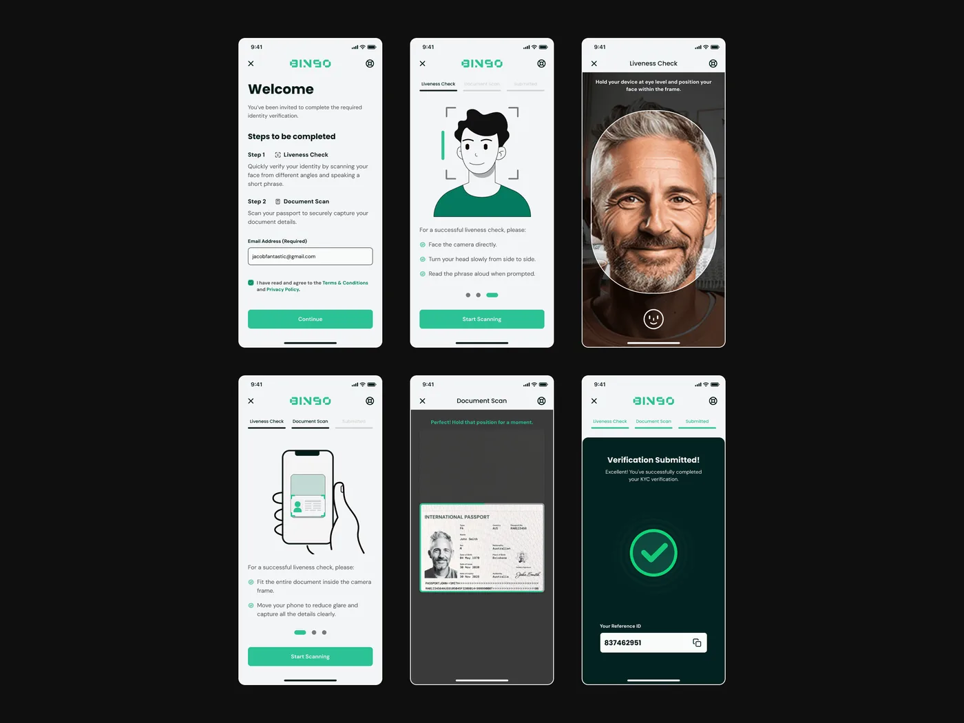
Verification opens with three screens before anything is asked: what to have ready, a good capture next to a bad one, and what happens after you submit.
- A welcome screen lists the two camera checks, Liveness Check and Document Scan, so the whole flow is visible upfront.
- Environment tips cover lighting and positioning before the camera ever opens.
- Requirements like masks, sunglasses and headwear are cleared before the check begins.
Guided onboarding with visual previews: 3 screens before verification starts, showing what you need, the capture to aim for, and what to expect before the camera opens.
A liveness check that guides
The camera step opens with an oval alignment frame and live position feedback, so a person sees where their face belongs before the check starts.
Voice liveness runs on the device, and on older Android handsets the model needs two to three seconds. A still screen that long is indistinguishable from a frozen app, and a faster model was not on the table.
- Position feedback responds live, so a fail is never silent.
- Each word is confirmed as the microphone hears it, so progress stays visible while the model decides.
Platform constraint
The answer was honest feedback, not a faster model. Participants could not tell the check was running; word-by-word confirmation fixed that without touching it.
The liveness check running, with live alignment feedback so it never feels frozen.
Errors and closure with equal care
Failing was designed with as much care as passing. Every liveness fail names its specific reason with a tailored fix, and the flow ends with real closure instead of a blank screen.
- Fail states name the cause: too dark, moved too fast, face not centred, each with a one-line fix.
- A visible retry counter caps at 3 attempts, then in-flow support replaces the generic error.
- Confirmation shows a copyable Reference ID and a 3-step timeline of what happens next.
Confirmation with next-step timeline: a Reference ID plus a 3-step timeline of what happens after submission, replacing a silent success screen with a clear sense of closure.
Screen archive - every screen in the build, 4 for the deep read
Outcome
Where it landed
The redesigned flow shipped to production on iOS and Android, and the retest ran the same protocol as the opening benchmark, so before and after are comparable.
More than half of new users had been unable to open an account. Nearly all get through now, and the ones who still fail a step are told which step and what to do about it.
What the work taught me
The redesign moved every metric it targeted, but the more durable lessons were about how the team worked.
Kill assumptions before designing
I went into the redesign believing what the team believed: users quit because the flow was too long. I was wrong, and one Lean UX Canvas workshop proved it before a single screen was drawn. That workshop cost an afternoon and redirected the whole four-month project.
Design the failure path first
The biggest gains came from where things go wrong: named fail reasons, a visible retry budget, support arriving inline. In a compliance flow, error states carry most of the completion loss.
Trust is a material
In a regulated flow, confidence decides whether people finish. Previews before cameras, plain language instead of error codes, and a Reference ID at the end cost almost nothing and moved completion more than any visual change.