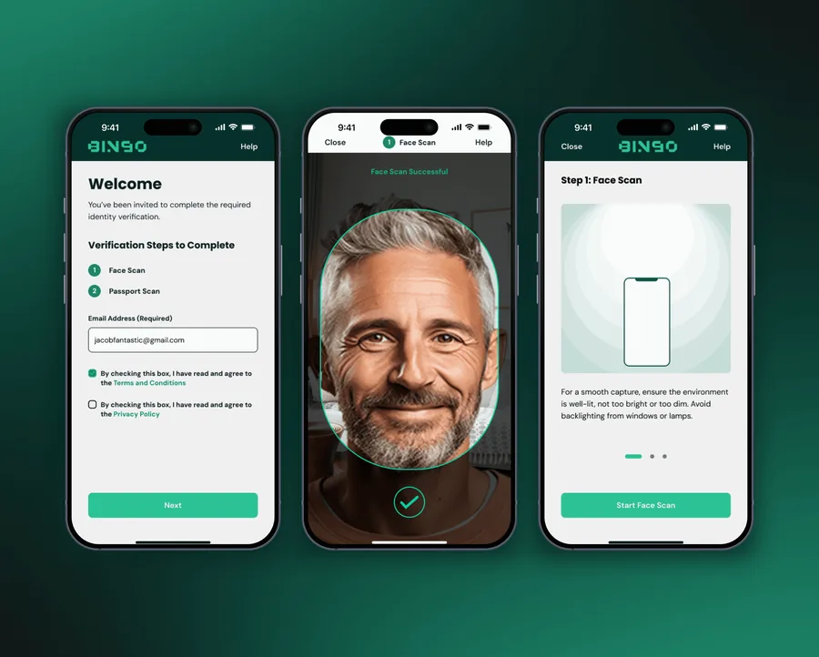
BINGO Admin Console
Optimised the information architecture and UI of the BINGO Admin Console for search, filter, and sort. Reduced task completion time by 68.3% and elevated the SUS score from 28 to 81 (D → A grade).
The problem
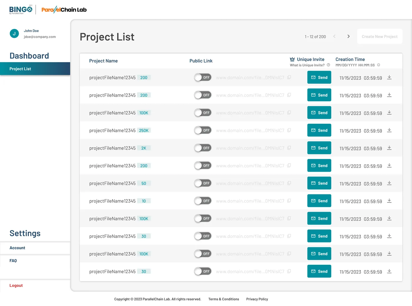
KYC compliance officers at BINGO lost hours each day to the admin console. Search matched exact prefixes only, so a misremembered client name returned nothing. Filters were three separate dropdowns that couldn't stack. Column headers used internal system codes nobody outside engineering understood. Task completion sat at 42%, and the average search took 4 minutes 28 seconds.
How it came together
Context
BINGO is a Southeast Asian fintech platform with regulated KYC requirements. Compliance officers use the admin console daily to review thousands of submitted client documents. The system had grown ad hoc for two years with no design review. By the time I joined, officers had built their own workarounds, mostly daily personal spreadsheets, because the system was too unreliable to depend on.
Research
I interviewed 7 compliance officers over two weeks. All of them said the same thing: they couldn't trust the search. One described how long it took to find a client from a few months back, because the filters were too basic and the labels confusing.
Benchmark usability testing put numbers on it. Task completion: 42%. Error rate: 60%. SUS score: 28 out of 100, a failing grade. Average task time: 4 minutes 28 seconds for a one-minute job.
How I structured it
Card sorting with 5 officers showed the existing labels didn't match how they thought about their work. They grouped by client status and date. BINGO's internal product categories meant nothing to them.
Tree testing on a proposed new IA validated the restructure before I touched any screens. I then mapped the primary task flow: search, filter, review, export. One clear path, no dead ends, no backtracking.
Design decisions
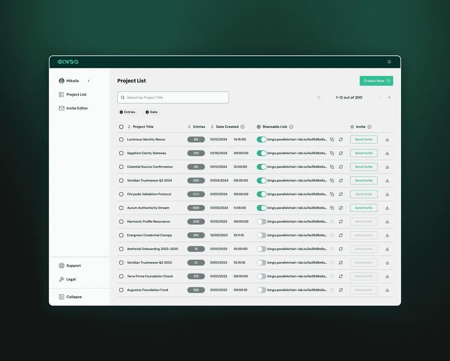
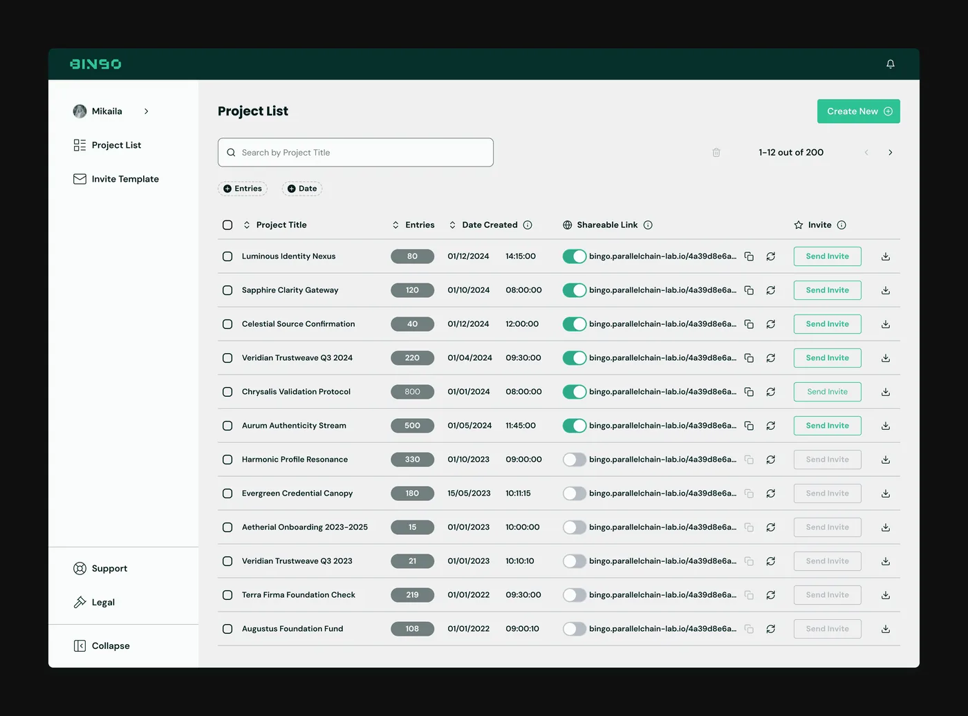
Three changes drove the result. Fuzzy search replaced exact prefix matching: edit-distance matching means partial names and IC numbers still return results, and autocomplete appears at 2 characters.
Filter chips replaced the stacked dropdowns. Chips stay visible, stack, and clear in one click, so officers see what's active without opening a panel.
Contextual tooltips explain every ambiguous label on hover. The copy went through review with the compliance team, so the explanations matched how they described the fields.
Process
Information architecture — before vs after
Challenge context
Define & structure
Information architecture
Key solutions
Fuzzy search + stackable filter chips
Replaced exact-prefix search with edit-distance matching and always-visible filter chips, so officers find what they need in one action.
Human-readable data labels
Replaced internal system codes with plain-language column headers. Tooltips surface detail on demand.
Persistent one-click export
Moved export from 3 levels deep to a persistent button, always visible and always reachable.
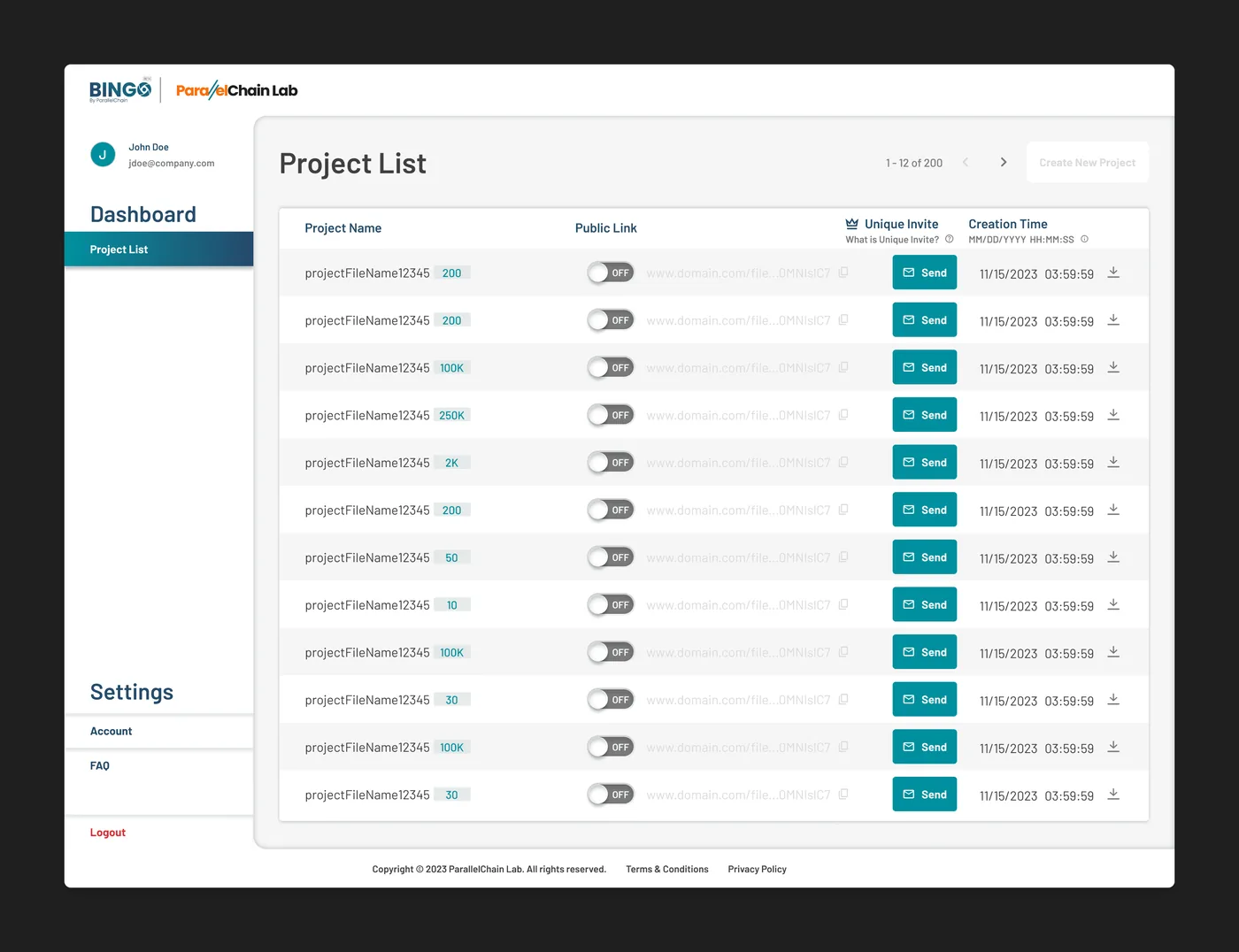
Before & after
All screens
Outcomes